
The Democratic Socialists’ of America 2019 National Convention was excellent and there has been a surfeit of great articles) about it. But despite all the writing about the convention, I had a thought which I have not seen addressed: what do the delegates’ ballots tell us about the internal structure of the new NPC? In particular, will the structure expressed in the ballots correspond to the candidates’ factional endorsements?
Ballots to Social Network
So how can I infer the internal structure of the NPC from the delegates’ ballots? Each time a delegate fills out a ballot, that says something about how similar the candidates are. The basic assumption of my analysis is that delegates place candidates they feel similarly towards close to each other on their ballots. From that assumption, I calculate the average distances from each candidate to each other candidate. Those distances, from each candidate to each other candidate, form a weighted, undirected social network.
Take this delegate’s ballot, for example:
| Rank | Candidate |
|---|---|
| 1 | Blanca Estevez |
| 2 | Kristian Hernandez |
| 3 | José G. Pérez |
| 4 | Darby Thomas |
| 5 | Sauce |
| 6 | Tawny Tidwell |
| 7 | Maikiko James |
| 8 | Erika Paschold |
| 9 | Jen Snyder |
| 10 | Hannah Allison |
| 11 | Sean Estelle |
| 12 | Jennifer Bolen |
| 13 | Jen McKinney |
| 14 | Megan Svoboda |
| 15 | Austin Gonzalez |
| 16 | Dave Pinkham |
| 17 | Timothy Zhu |
In doing this analysis, I read that this voter has a pretty similar preference for Austin G as they do for Megan S and for Dave P. Each of those pairs are separated by 1 rank. Similarly, this voter separates Sauce and Jen Snyder by 4 ranks.
The conceit of the analysis is that this similarity of preference is reflective of a similarity in the candidates. And this similarity of candidates will manifest as an internal structure of the NPC.
Go through all those steps and this is what you get:

The algorithm that spaces the nodes is called the Fruchterman-Reingold layout algorithm. The algorithm puts candidates closer the closer they’re ranked on the ballots. Because the algorithm doesn’t always perfectly match all the distances to rank differences from the ballots, I shaded edges darker the closer ranked the candidates tend to be.
It appears there are somewhere from 2 to 5 clusters of candidates in this network. This is interesting to see because it corresponds to roughly the same number of factional groups of candidates that did NPC election endorsements.
Social Network to Structure
From here, all that’s left is to run a community detection algorithm. This kind of algorithm explores the network and finds communities of nodes which are closely linked to each other.
Here’s a simple example of a three-community network from Wikipedia:

You can see it’s not that the communities are completely disjointed. They are linked to each other. It’s that there are more connections inside the community than outside it. That leads to a natural question: how densely connected do these communities need to be to draw the line at inclusion in them?
When you’re doing social network analysis as part of a scientific analysis, you might have other variables which you can benchmark your communities against. But in the case of this analysis, I’m just discovering the communities and don’t have much data on the candidates. So I’ll just be going with the default community detection algorithm here.
In this case the community detection algorithm is known as infomap community finding (Link to code with citations). The basic idea of the algorithm is you walk around the graph from node to node at random, more likely to move to closer nodes than farther ones. And the communities are clustered nodes where you spend most of your time.
Run the algorithm and this is what you get:

Great, so five communities. If you paid close attention to the candidates, you can probably guess the three in the blue community. And if you were at the convention or paid close attention to internal DSA politics, you can probably guess the two in the violet community.
Take a moment to think about it for fun and then scroll below, where I add the names in.

Does it match your preconceptions about candidates’ closeness to each other? It’s pretty close to mine! Let me know what you think this analysis gets right or wrong on Twitter.
Thanks for reading! If you enjoyed the writeup or have criticism or ideas, be sure to e-mail me or Tweet me. My Twitter is linked at the top and my e-mail is my first name @ this domain.
Appendix
So long story short, my task in code is to
- process the data from all the ballots,
- find how closely ranked each candidate is to each other candidate on average.
- plot these results in a social network, and
- use community detection to find structure in the network.
So here is my code with minimal comment. Please be forgiving as this was coded up in a hurry! Feel free to reach out with questions or thoughts.
0. Setup
suppressPackageStartupMessages(library(tidyverse))
suppressPackageStartupMessages(library(tidygraph))
suppressPackageStartupMessages(library(ggridges))
suppressPackageStartupMessages(library(igraph))
library(ggraph)
options(max.print = 500)
winners <- c(
  'Abdullah Younus',
  'Austin Gonzalez',
  'Blanca Estevez',
  'Dave Pinkham',
  'Erika Paschold',
  'Hannah Allison',
  'Jen McKinney',
  'Jennifer Bolen',
  'Kristian Hernandez',
  'Maikiko James',
  "Marianela D'Aprile",
  'Megan Svoboda',
  'Natalie Midiri',
  'Sauce',
  'Sean Estelle',
  'Tawny Tidwell'
)
1. Process the Data
The new pivot_longer function in the tidyr package is indispensible. I’m really glad to see its addition into tidyr. Side note: I’m not distributing the data with this analysis because I don’t own it. But I have been told you can download it from the DSA forums if you wish to run this or another analysis yourself.
dat_wide <- read.csv('ballots.csv', header = TRUE, stringsAsFactors = FALSE)
dat_wide[, c('Voter.First.Name', 'Voter.Last.Initial')] <- list(NULL)
names(dat_wide) <- c('voter', 'chapter', 1:32)
ballots <- pivot_longer(
  dat_wide,
  cols = -c(voter, chapter),
  names_to = 'rank',
  values_to = 'candidate'
)
ballots <- ballots[ballots$candidate != " ", ]
ballots$rank <- as.integer(ballots$rank)
ballots$candidate_is_winner <- ballots$candidate %in% winners
2. Compute Candidates’ Distances to Other Candidates
Here I use merge from the base library because I think its syntax is a lot nicer than dplyr’s join syntax.
An important remark here is that I only incorporate rank distance information when it’s recorded in an observation. This is despite the fact that it’s plainly obvious that rankings are missing data, specifically what is known as either missing at random or missing not at random. We can gain information from analyzing missing data at the same time as present data. But that is way out of the scope for this analysis, perhaps a future one. 🙂
rank_pair <- merge(
  ballots[, c('voter', 'candidate', 'rank')],
  ballots[, c('voter', 'candidate', 'rank')],
  by = 'voter',
  suffixes = c('_from', '_to')
)
rank_pair$voter <- NULL
rank_pair$distance <- abs(rank_pair$rank_to - rank_pair$rank_from)
rank_pair_short <- rank_pair[rank_pair$candidate_from > rank_pair$candidate_to,]
rank_diff_mean <-
  rank_pair_short %>%
  rename(ego = candidate_from, alter = candidate_to) %>%
  group_by(ego, alter) %>%
  summarize(weight = mean(distance))
dat_gph <- rank_diff_mean
2.5 The Special Sauce
dat_gph$weight <- 1/(dat_gph$weight^4)Here I transform weight --> (1/weight)^4.
Why reciprocal? The weight is a representation of closeness, but rank distance is an expression of distance. So they are negatively related to each other.
Why the fourth power? The fourth power here is spreading candidates out from each other, inflating distances from farther away candidates. What’s going on here is that the range of mean rank distance is too small to tell clusters apart. No spreading leads to a network where you have one cluster. Lower spreading than fourth power leads to a network that is more or less degenerate, spread out only in a line.
Try it out and let me know what you think might be a better approach.
3. Plot the Network
Like I noted before, I use the Fruchterman-Reingold force-directed layout.
gph <- graph_from_data_frame(dat_gph, directed = FALSE)
gph_tdy <- as_tbl_graph(gph)
set.seed(4793461)
gph_tdy %>%
  mutate(community = as.factor(group_infomap(weights = weight))) %>%
  ggraph(layout = 'fr') +
  geom_edge_link(aes(alpha = weight), show.legend = FALSE) +
  geom_node_point(size = 7, alpha = .3) +
  theme_graph()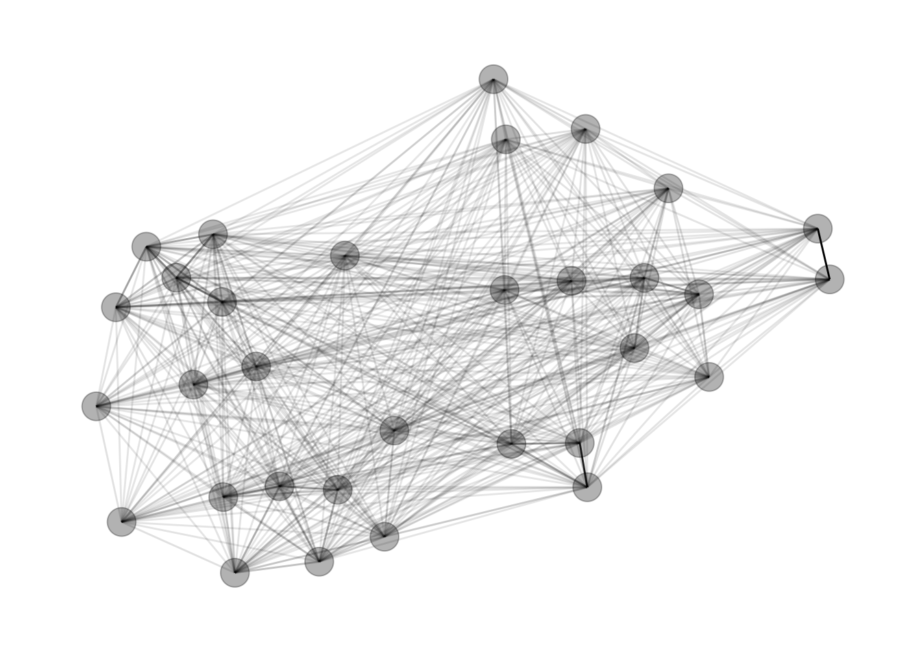
4. Plot the Communities
Add in the community computation with the group_infomap function.
set.seed(4793461)
gph_tdy %>%
  mutate(community = as.factor(group_infomap(weights = weight))) %>%
  ggraph(layout = 'fr') +
  geom_edge_link(aes(alpha = weight), show.legend = FALSE) +
  geom_node_point(aes(colour = community), size = 7) +
  theme_graph()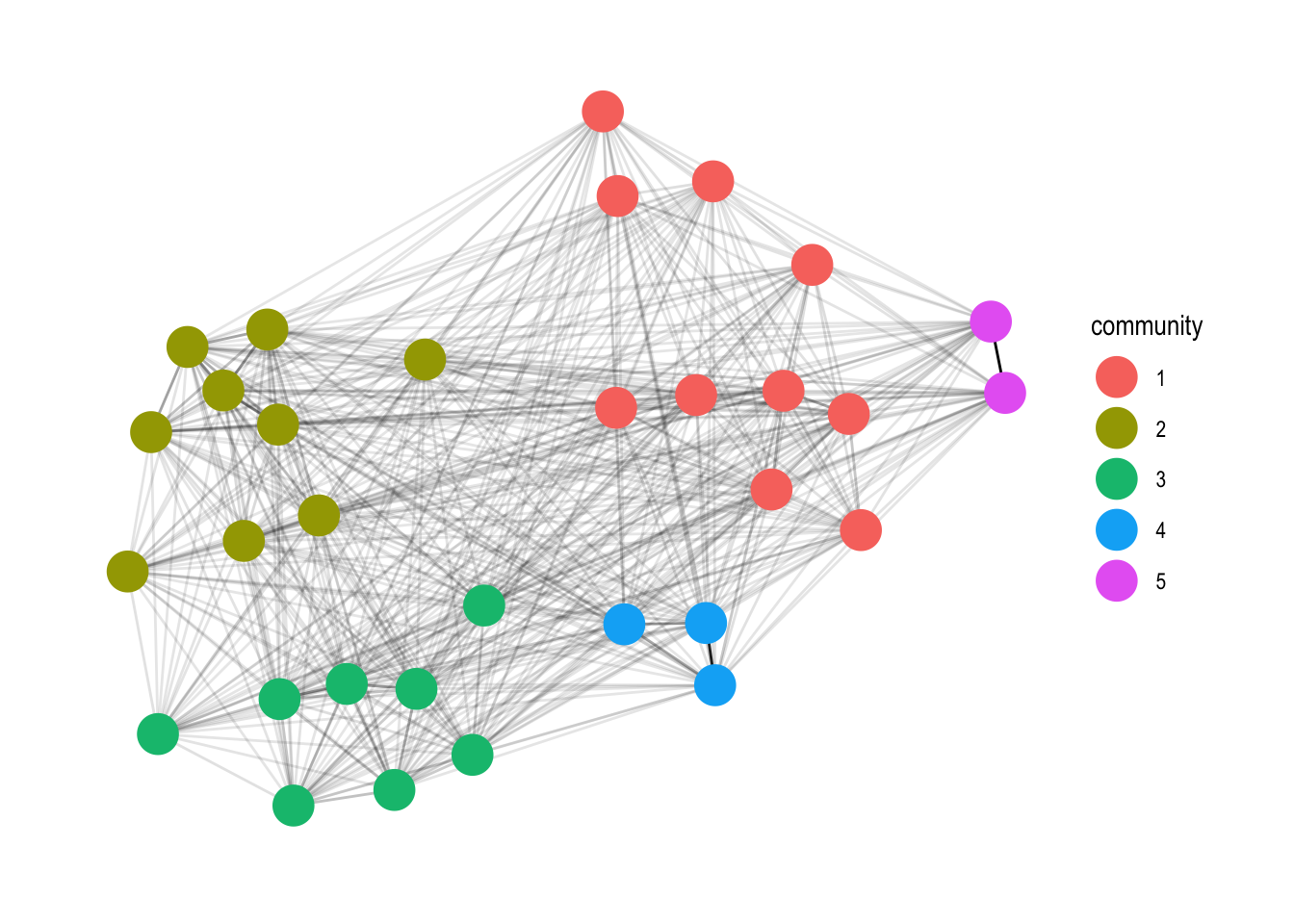
set.seed(4793461)
gph_tdy %>%
  mutate(community = as.factor(group_infomap(weights = weight))) %>%
  ggraph(layout = 'fr') +
  geom_edge_link(aes(alpha = weight), show.legend = FALSE) +
  geom_node_point(aes(colour = community), size = 7) +
  geom_node_text(aes(label = name), repel=TRUE) +
  theme_graph()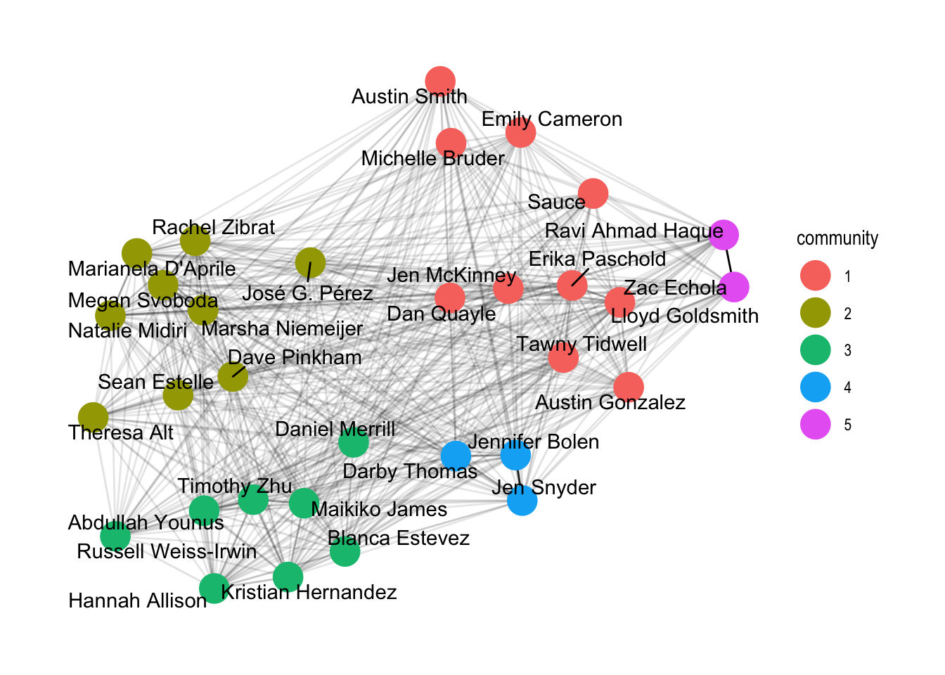
Social Networks
I decided to tackle it with social network analysis. Scientists use social networks to analyze the ways individuals connect with each other and how these connections form larger structures. For example you might build a social network where each node is a person and nodes are connected by an edge representing friendship.
Here are two social networks representing high school friendship data, courtesy of Thomas Lin Pedersen.
Social networks can be directed (think Twitter follows, unilateral); undirected (think Facebook friendships, reciprocal); weighted, where connections have amounts; and unweighted, where you’re either connected or not. For example, a directed, weighted network is formed of individuals’ Venmo payments.